Welcome to
GADFLY.AI. We weave the real-life narratives of a modern developer's experiences building code for community impact. Teaching creatives and engineers how to explore the world around them through data.
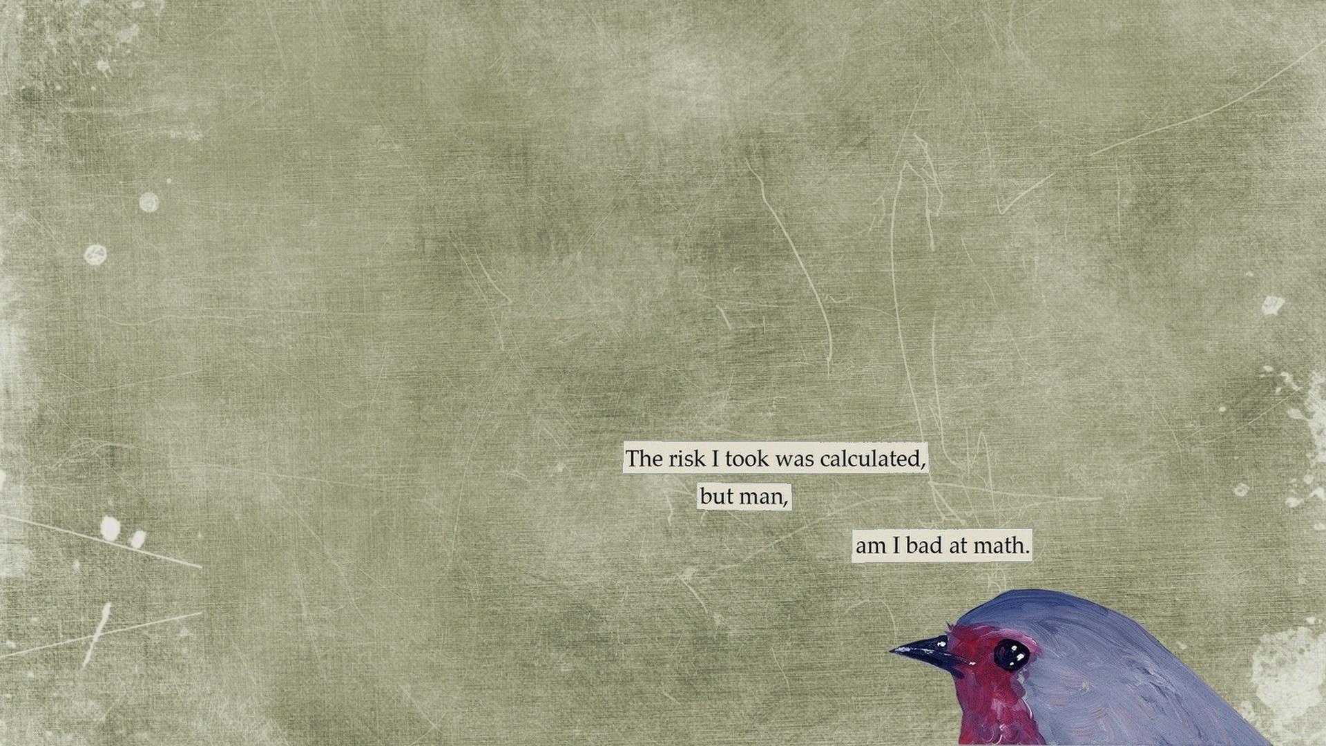
︎︎︎scroll to view machine learning stories︎︎︎
/WOMEN IN THE WORKPLACE/BEAUTY TECHNOLOGY/PSYCHOLOGICAL EFFECTS OF SOCIAL MEDIA/TREND ANAYLSIS/ALGORITHMIC FUNDING


/WOMEN IN THE WORKPLACE/BEAUTY TECHNOLOGY/PSYCHOLOGICAL
EFFECTS OF SOCIAL MEDIA/TREND ANAYLSIS/ALGORITHMIC FUNDING
GADFLY.AI_TEAM
Sara Kimmich - Founder, Technical Community Lead
Anova Hou - Creative Director
Kseniia Borovkova - Digital Community Outreach
Anjali Ramesh - Machine Learning Advocate
Emily Yang - Machine Learning Advocate
Uyen Nguyen - Machine Learning Advocate
Yan Lawrence - Machine Learning Advocate


Anjeli Ramesh
Project_Research On Women
VIEW CODE
“This project is aiming to explore and analyze the experiences of women in the workforce, whether that be during interviews, in the workplace, participation, wage gaps, leave policies, or other factors.”

- My favorite failure this week was having very little time to spend combing through the datasets that I had chosen, and instead spending that time taking many many midterms. Although on the bright side, looking at datasets was a nice break in stressing over all the papers waiting to be written.
- My favorite false start this week was eliminating the datasets I had previously chosen for different reasons, which led to me either getting rid of them completely, or saving them for later projects that I’m also excited about.
- My secret superpower this week was narrowing the scope of my project and getting a clearer idea of what purpose this data science project will serve. This has helped me visualize what I have to do from this point in general terms, which is really reassuring going forward. Having a chosen dataset and a more specific objective makes me feel like a lot of progress has been made from when I first started, and this is comforting, especially with the craziness of this week.
- This was my favorite data visualization this week, because I think it’s a really interesting and unique way to show change. It represents the shift in margin (either more Democratic or more Republican) from the 2016 general election to the 2020 general election in counties across the country. This visualization provides information about a very large number of locations and does it in a way that’s easy to understand and quite simple. I like this concept of representing change, and it relates pretty directly to something I want to show, which is the change in female participation in the workforce in each state from 2011 to 2018.
Uyen
Nguyen
PROJECT_Data Science
VIEW CODE
We are building a prediction algorithm for the Kiva loan project to identify the most needy communities and regions to give financial funding to. Individual funders and the Kiva fund planning team can look at the analysis, which inspects MPI index, historic amount of funding and correlation to economic development, and decide where to continue funding.
- What was a favorite failure: logarithmic data transformation for a histogram
- What was your favorite false start: not separating my projects into smaller tasks to give myself more motivation to complete each step.
- What was your secret superpower: Googling the right thing
- What was your favorite data visualization, and why? Treemap, because it shows relational proportions of different categories in a logical way//
- What was a favorite failure: finding the right algorithm for my prediction problem
- What was your favorite false start: making the problem too complicated.
- What was your secret superpower: not afraid to ask questions
- What was your favorite data visualization, and why? bar charts, because they are simple to build but can deliver the message across very well.
An Yee Tan
Project_ Social Media Usage and Psychological Effects
VIEW CODE
The purpose of the project is to benefit people to understand the link between usage of social media, the content they are exposed to, and the psychological effects that may arise.
We are building this because there are many kinds of content on the social media, where different kinds of contents may result in different purpose and effects. For instance, infographics about certain topics may be educational, while photos about personal life may just merely for sharing with friends.
We wish to benefit the users of social media, specifically Generation Z. We hope that our findings will allow people to be more aware of their usage of social media, especially the content they are exposing to. Hopefully, this research will be able to allow people to be more conscious and more objective when using social media.11What was a favorite failure
- My favourite failure was to get astray from my initial project design. While it was a little disappointing, I am still grateful that I found the dataset that I am currently having, because it is also in the area that I am interested in exploring. And plus, I get learn about GIS!
What was your favorite false start - My favourite false start was thinking that the author of the dataset would respond to my email… The author hasn’t responded and I feel like he wouldn’t. I feel like I would need to look it up and try to understand what the “event_id” column stands for
What was your secret superpower - I usually listen to music when I am studying. Because I need to do things effectively and get things done in time, I told myself try to just work, and not listening to music. It felt strange at first because this is not the working style I had, but surprisingly I find myself work so much more effectively!
- My favourite data visualization was the map of the United States during the US election on theguardian.com ! Not only because this is the map I was looking all the time last week, but also I really like it how they make so easy to understand, as well as updating in every 13 seconds. I like it when we point at each state, we are able to know the percentage of counted votes and they tell us the number of electoral votes each state. And when we click on each state, it shows the information from each county. It is so interesting to understand!I like how they include the section for key states to watch, because it helps people to understand the situation so much better, especially for people who are not from the US (like me!). They used to have a table for the key states before the result was out. The table consists of the marginal votes which I think was really helpful in understanding the situation too.
Kseniia Borovkova
Project_ ConvTrends
VIEW CODE
ConvoTrends is an application that analyzes text messages. With its help, users draw valuable insights from their online conversations and can see the trends and patters in them.
Yan
Lawrence
Project_The Regime Beauty Technology
VIEW PROJECT SITE
Using data science and machine learning, engineers use consumer answers to determine the best routine and products on the market for curly hair goals and
needs.